01Planning
Turning a global aviation platform into a guided story.
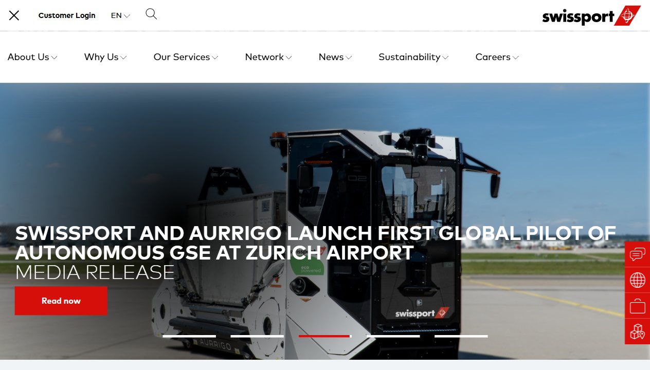
The planning frame starts with a broad homepage: corporate navigation, aviation services, global network discovery, customer self-service, media releases, customer trust, and careers. The portfolio page presents that scope as a clear project narrative instead of a flat page recap.
Homepage scope / stakeholder goals / service discovery02Design Thinking
Make complex B2B content feel direct, not heavy.
The editorial structure favors scan rhythm: short labels, strong section contrast, visible proof points, and large visual crops. The goal is to help decision makers move from brand confidence to service understanding without digging through every menu branch.
Hierarchy / scannability / decision support03Customer Integration
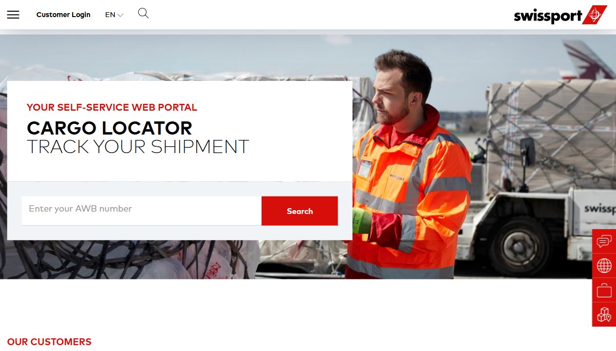
Service routes stay close to the customer task.
Customer login, cargo tracking, contact paths, service filters, and local network discovery are treated as practical business moments. The showcase keeps these conversion and support paths visible inside the same narrative as the brand story.
Customer login / cargo locator / contact paths04Design System
A restrained interface language with aviation signal.
The visual system borrows the clarity of Swissport's public presence without copying it: white space, black typography, confident red signal lines, dense content modules, and reusable editorial patterns for screenshots, data, and process text.
Type scale / red signal / reusable modules05Google Maps Custom Integration
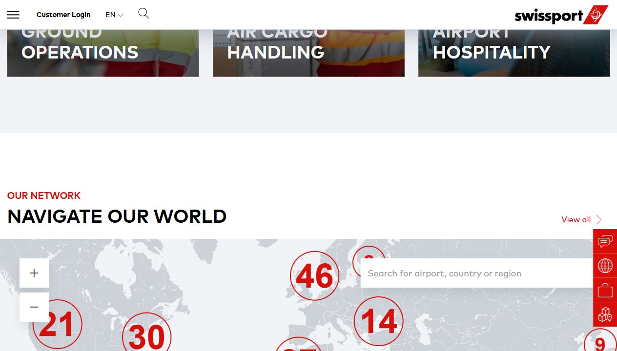
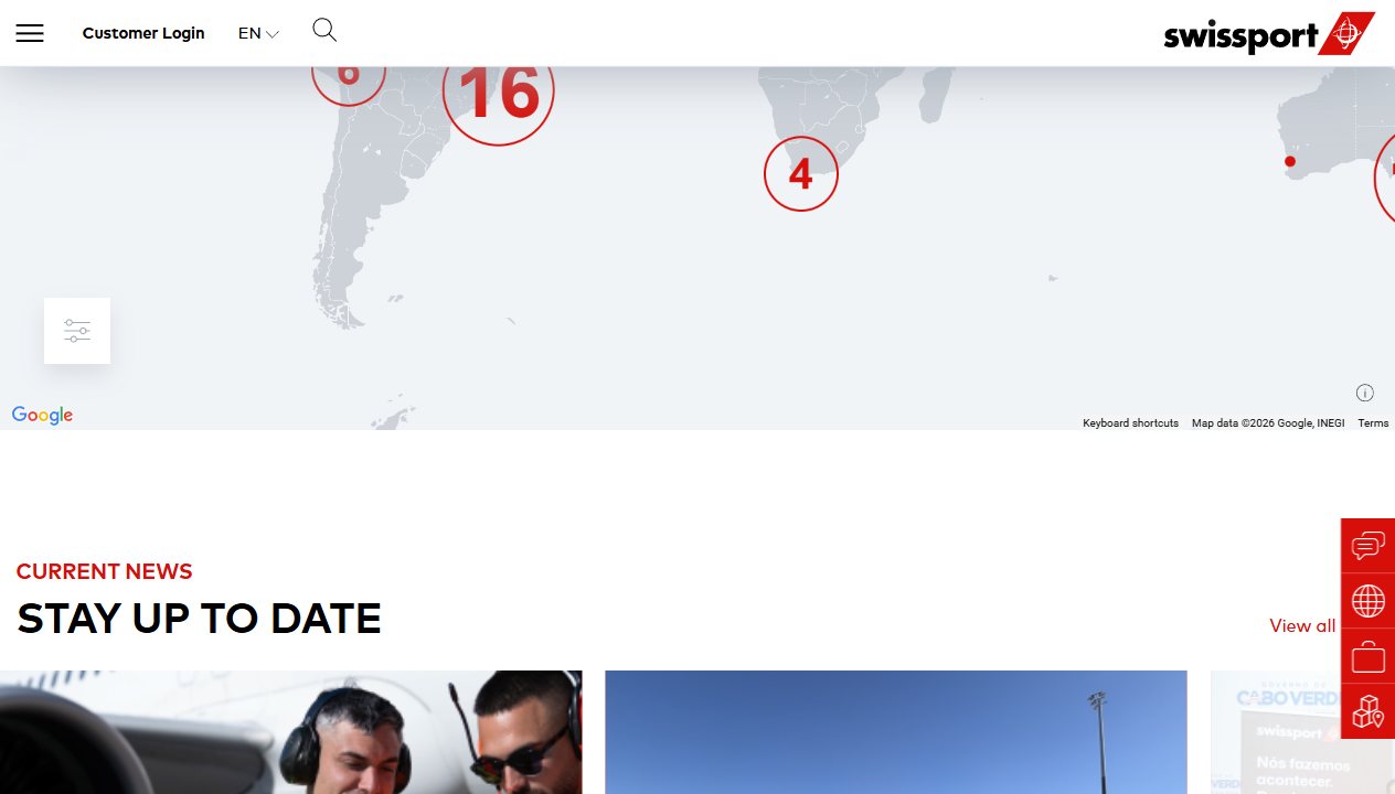
A clustered network view for airports, services, and contacts.
The map section presents the intended integration shape: clustered airport markers, region scanning, service filters, and local contact entry points. Without production keys or internal datasets, this portfolio version uses a designed map model that communicates the interaction system.
Cluster markers / service filters / regional drilldown06Services Architecture
Ground operations, cargo, hospitality, and hub handling stay legible.
The service model is grouped into clear families so a visitor can understand Swissport's single-source portfolio quickly. The page separates primary services from detailed capability areas, then uses motion to reveal structure without making it feel mechanical.
Service families / navigation model / content grouping07Global Network
Six continents and 312 airports become a navigable experience.
The live homepage positions Swissport's global network as a core proof point. In the case study, the network section becomes a pinned editorial moment with route lines, regional clusters, and a slow horizontal reel of captured page states.
312 airports / six continents / local discovery08Motion & GSAP
Motion supports orientation instead of performing over the content.
The animation system uses scroll progress, measured reveals, pinned passages, screenshot parallax, clustered map activation, and desktop-only horizontal movement. Compact viewports keep the same content available without forcing pinned interactions.
ScrollTrigger / pinned reel / reduced motion09QA, Accessibility & Performance
A rich page still has to be stable, readable, and respectful.
The build keeps headings semantic, links explicit, image dimensions stable, and reduced-motion handling in place. The visual layout is designed to avoid overlapping text on mobile while preserving the dense editorial feel on desktop.
Responsive QA / alt text / reduced motion10Deployment
Portfolio registration turns the case study into a shipped page.
The final route is added to the portfolio registry, navigation, sitemap flow, and SEO head helper through the existing configuration pattern. The live Swissport source stays one click away in the page navigation and finale.
Qwik route / portfolio config / live source CTA